Heiroom - Elderly User Interface
Heiroom is a private social media startup focused on connecting families and preserving memories in an ad-free digital environment. In January 2022, my senior capstone research team was tasked with researching how elderly users interact with technology, understanding the pain points they encounter when using social media, and creating guidelines for designing for this population
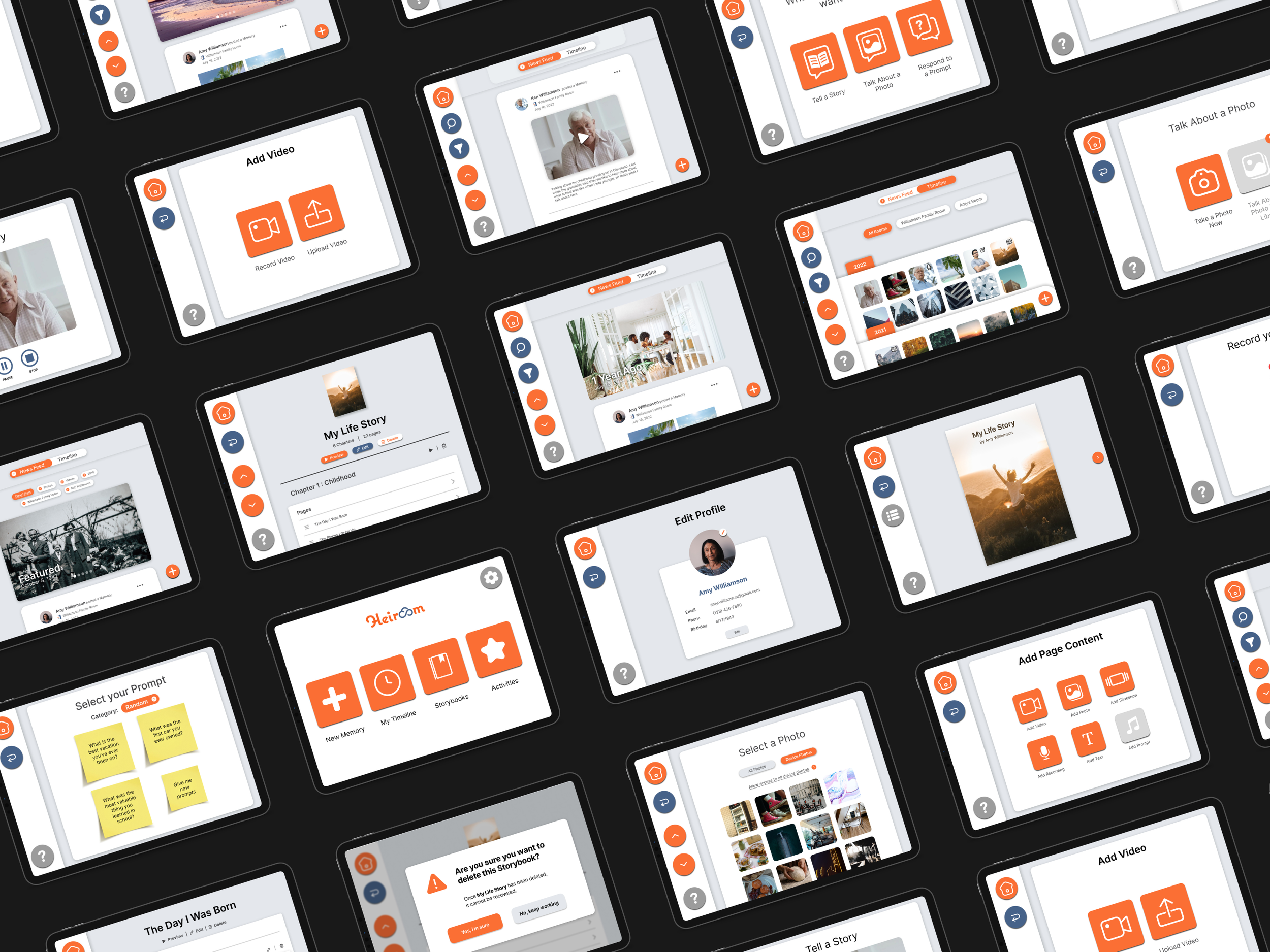
At the end of the semester, I joined the Heiroom team full time as the Lead UI/UX Designer, and personally created a high-fidelity prototype for the Elderly User Interface (EUI). During my 18 months on the Heiroom project, I designed over 300 screens and coordinated with developers to manage the development of the Heiroom EUI beta for iOS.
My roleUser Researcher (Student Capstone)
UI/UX Designer (Full Time)
Day to day designer
DateJanuary 2022 - July 2023
How might WE…
Create a social media interface that accomodates elderly users?

Step 1:
Discovery Research
Our first step was to understand the existing research on Designing for Elderly users (or EUs). To read the full writeup, click here.
Findings:
Only 23% of EUs are comfortable using technology.
Source: Anderson, M., & Perrin, A. (2019, December 31). Technology use among seniors.
EUs become less comfortable as technology becomes more complex.
via Senior Capstone Survey (Qualtrics)
EUs are more comfortable using interfaces with familiar components and layouts.
via Senior Capstone Survey (Qualtrics)
Some Eus have “leathery fingertips”, a condition which makes it difficult to swipe on touch screens.
via Senior Capstone Survey (Qualtrics)
existing interfaces for elderly users utilize bright colors and simple shapes.
via Senior Capstone Market Research
Step 2:
User Needs Exercises
Our next step was to deeply understand our user base and create design guidelines based on our user needs exercises and discovery research. The full writeup for this portion can be found here.
Personas:
Goal: understand the lives, needs, goals, and challenges of our target users
Empathy Map:
Goal: understand the user’s decision-making process by analyzing their thoughts, words, feelings, and actions.
Step 1: Brainstorm what the user thinks/feels/says about and does with technology.
Step 2: Group common threads within each category (positive/negative feelings, does alone/with others).
Takeaways:
eus feel conflicting emotions about technology, balancing need with unfamiliarity.
EUs need an interface that requires minimal cognitive workload to use.
Step 3:
Design Solutions
Based on our research, we designed preliminary screens for the EUI. We conducted two rounds of user testing to validate our design findings (Round 1) (Round 2) before publishing our Final Report. Below are the screens I designed myself as the Lead UI/UX Designer at Heiroom after the conclusion of the Senior Capstone Research.
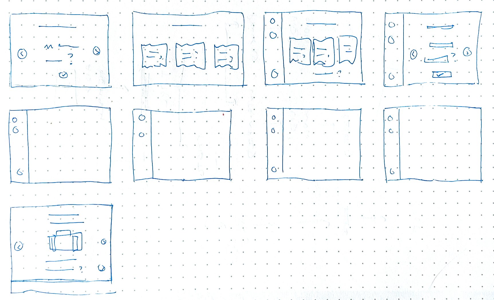
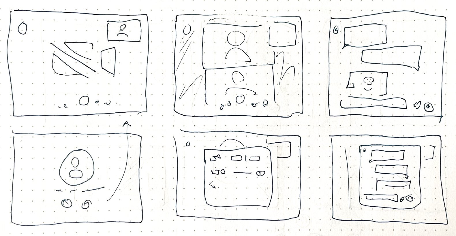
Sketches:
Final Screens:
Color and Font
To maximize visibility I used bright colors on the interface’s most important buttons. Heiroom’s existing branding provided a bright, eye-catching orange color. The font is Inter, a simple sans-serif font that maximizes readability.
Button Design
Buttons in the EUI are large, colorful, and emphasize the use of text labels over icons. The goal was to reduce the user’s cognitive load by removing any icons that could be interpreted with multiple meanings.
Scrolling Options
The condition known as “leathery fingertips” is common among elderly users, and makes touch screens less responsive (especially to swiping motions). The EUI automatically offers scrolling arrow buttons to allow users of all types to seamlessly navigate the interface.
Skeuomorphism
Portions of the EUI mimic real-world elements (like photo folder “tabs”) to create a feeling of familiarity with the system. Even among new users, this skeuomorphism can increase comfort and ease of use within an interface.
Page titles
For tasks that involve multiple steps, I phrased the titles of each page as questions rather than statements (e.g. “What kind of memory do you want to record?” instead of “Select recording method”). This creates a sense of personal interaction between the system and the user.
Parallel processes
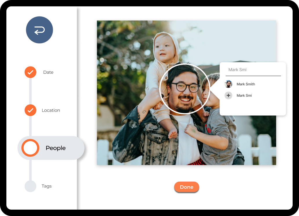
The EUI uses consistent processes for completing tasks (even in different sections of the interface) to reduce cognitive load. Creating new media (audio, video, or photo) always follows the same 6 steps to clearly walk the user through the process and create familiarity with the system.

Conclusion
Designing the EUI was a valuable project in practicing focused user-research and applying findings to create design guidelines. Understanding the user needs of elderly populations was a challenge, but one that ultimately led me to new understandings of usability and accessibility.
The EUI nearly reached completion in the development phase before Heiroom decided to cease operations. Despite this, it proved a valuable learning experience on leading a UI/UX project from ideation to wireframing to deployment. To this day, it’s the most ambitious and extensive design project I’ve undertaken.
To read the final report from my Senior Capstone Research group, click here.
More Projects
Increasing efficiency and accountability in invoicing.COG
Creating A FESTIVE, KID-FRIENDLY READING APPTwas200


