Santa’s Story - A Holiday Reading App
Working with Pop the Cork Publishing CEO Sally Veilette, I helped create an e-reader app that centered Sally’s multilingual translations of ‘Twas the Night Before Christmas, a holiday poem by Clement Clarke Moore. After the poem was translated, re-illustrated, and published in over 20 languages, the Santa’s Story app helped the 200th anniversary edition of the poem reach new heights and new audiences.
I acted as the UI/UX designer to prototype the Santa’s Story app in Figma, which allows users to read the poem from their mobile and tablet devices.
My roleUI / UX Designer (Freelance)
Project Manager
Day to day designer
DateOctober 2023 - Present
How might WE…
Create a festive, kid-friendly e-reader app?
Initial Analysis
Based on a task analysis and user flow analysis, I identified the core features of the Santa’s Story app. Users need to be able to:
Create Santa’s Story accounts.
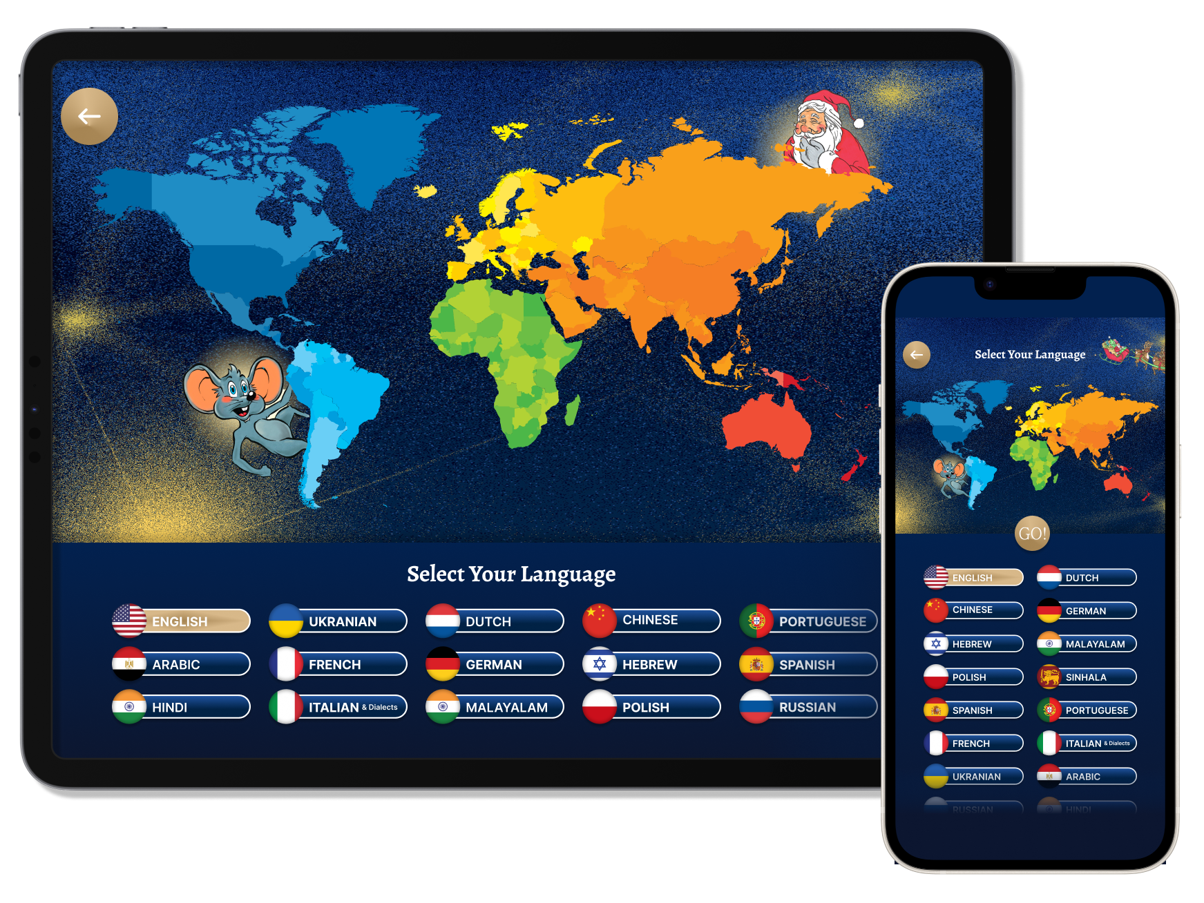
Select a language to read the poem in from Sally’s 20 global translations.
Purchase new languages.
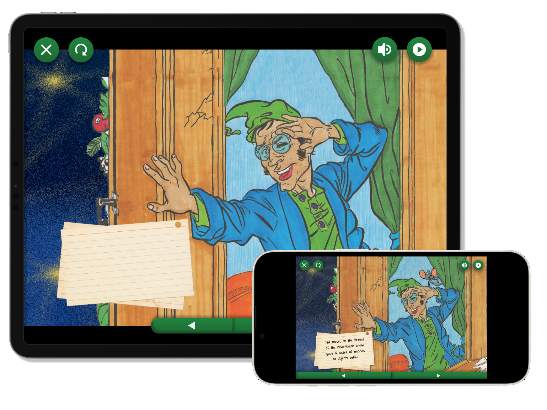
Adjust their reading experience with audio, animation, and page settings.
Read the poem in an immersive and branded interface.
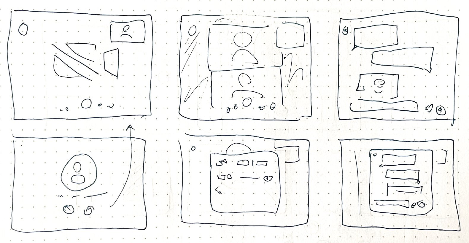
Based on this, I created the site map and began developing the app’s wireframes.
Design Solution #1
How can we blend kid-friendly aesthetics and clear branding with usability and function?
Solution: Create a clear, simple interface embellished with illustrations from the actual storybook. The book features a mouse character that also appears throughout the app to guide and aid the user.
Design Solution #2
With 20 international language translations, how do we display the global aspects of the app in a clear, engaging, and educational way?
Solution: Use a colorful appealing world map that lights up when a language is selected. The highlighted map shows the countries where the selected language is officially spoken.
Design Solution #3
Twas200 uses a pay-per-language model with in-app purchases. How can we make this process clear and make it easy to purchase language packages, view current languages, and add new ones?
Solution: Language packages clearly demonstrate the different options available to users as festive “presents”. A language purchasing screen clearly demonstrates which languages a user has already purchased, and highlights new languages.
Design Solution #4
When reading the poem, users need to access settings for sound, animation, and more. How can we allow them to access these options without intruding on the reading experience?
Solution: A series of pop-up buttons offer users access to quick actions like toggling audio, autoplay, restarting the book, and exiting.

Conclusion
Santa’s Story me to take my design to new, maximalist heights. Sally’s vision for the app was fun, festive, and far different from my usual clean gridlike design aesthetic. Through this project, I learned to balance my need for usability with exciting visuals and aesthetics.
I am still overseeing the development of the Santa’s Story app as it marches towards publication on the Apple and Google app stores. To learn more about Twas200, visit the company’s website (which I also designed in Wordpress).


