Christmas200 - Logo Redesign & Marketing
Christmas200 is the overarching company I worked with to develop the Twas200 app in 2023. Their goal is to revitalize the magic of the Christmas season by educating people on the history and context of Clement Clarke Moore’s holiday classic poem, ‘Twas the Night Before Christmas. As the company looked to modernize and expand its brand presence, CEO Sally Veillette contracted my skills as a graphic designer to redesign their old logo (at left) and conduct a brand-identity overhaul.
After redesigning the logo, I assisted Sally in creating marketing materials that adhered to the brand guidelines I created. These materials were published in StoryMonsters magazine’s print and digital editions. I also created content for the Christmas200 Instagram, the Christmas200 website, and numerous other promotions.
My roleGraphic Designer (freelance)
DateNovember 2023
Project Assessment
Step 1:
My first step was to review the old logo, and talk with the client about their new vision for the brand.
Old Logo Assessment
new Logo Vision
The logo must include the new company name, Christmas200.
The logo must incorporate Santa.
The logo should retain visual similarity to the old one, to avoid alienation and confusion.
The logo should share a similar visual identity to the illustrations in the already-published book.
The logo should be joyful, festive, and fun while maintaining professionalism.
The logo should follow the conventions of good design and address the shortcomings of the previous design.
The logo should be flexible, allowing for uses in print and digital designs.
Ideation
Step 2:
After understanding Sally’s vision for the new logo, I went ahead with sketching the new design. I also looked for inspiration for which Santa to include in my final design.
Seeking Santa
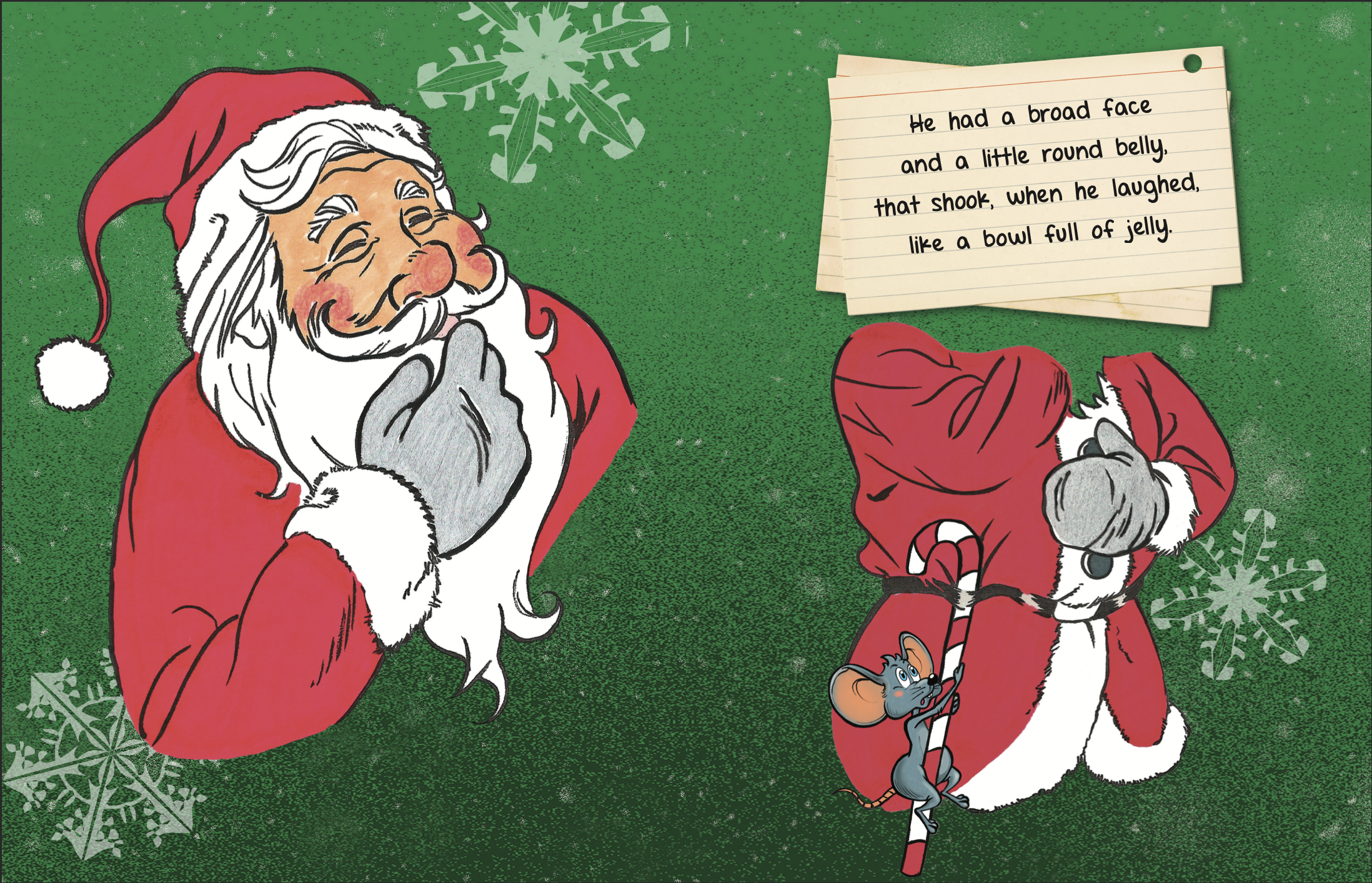
Sally specified the new logo must contain a Santa that was visually similar, or even the same, as the one present in her already-published illustrated copies of ‘Twas the Night Before Christmas. I sourced the Santa in the final logo from the book itself, using Illustrator to refine and simplify the lines.
Font Choice
For the font, I used Klarissa, a blocky serif font with clean lines and a traditional feel. This font perfectly matched Sally’s request for a joyful and festive feel without sacrificing readability. The serifs evoke the history and longevity of Clement Clarke Moore’s classic poem without feeling too dated or complicated.
Final Designs
Step 3:
With a clear framework for the layout, the main graphic, and font decided, I went ahead with creating the final logo. I also created various print materials for Christmas200’s various holiday events in upstate New York, the birthplace of Moore’s poem.
Logo Breakdown
Variants & Branding Kit
StandardFor all-purpose uses
SIMPLEReduced detail for use at small sizes
Logo MarkFor small size and text-free use
Logo/WordmarkFor horizontal layouts


